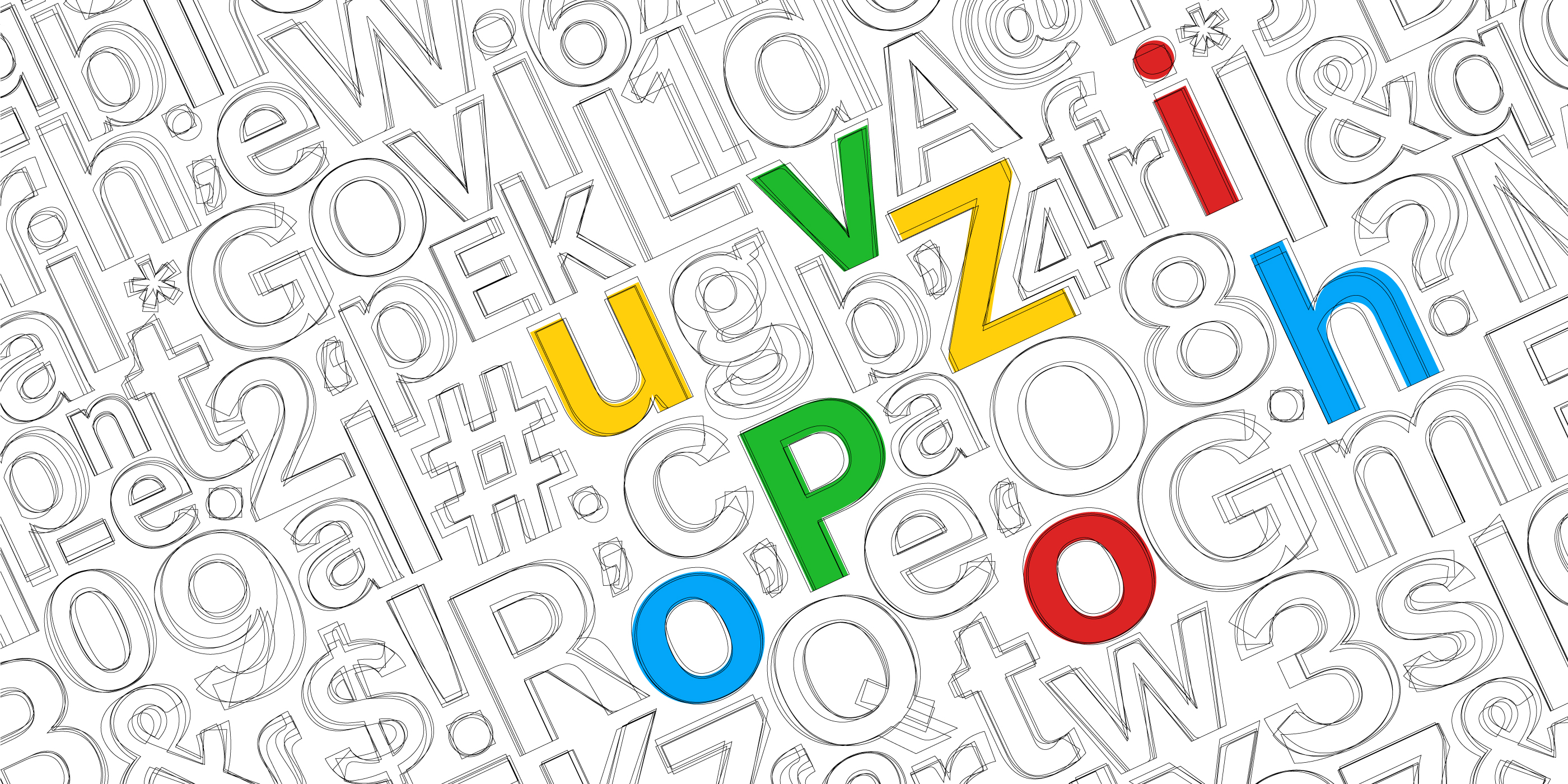
Each typeface has its own unique personality and purpose. Serif is more traditional and sophisticated while Sans Serif has a modern and clean personality. Script is elegant and classic while Slab Serif is bold and contemporary.
Arial Black screams and can't be ignored. Times New Roman can't tell you a joke. Can you imagine Comic Sans on a legal document?
Each font has its own characteristics, designed by people with unique design approaches, for their own target audience and intended use. One doesn't necessarily play well with the other.

With Our Hands Tied Behind Our Backs
In Zoho, text is the primary medium of communication with our users but we have always had one problem with it.
In all of our written content, we were only able to control what words we used and where. But, how the words appeared and how they were perceived was dictated by the font. Some fonts worked well on our websites, billboards and some worked well inside our products. Some look good when they're big and some when they're small. So, there was an obvious inconsistency in our font choices and more importantly, they didn't gel well with our design thinking. We couldn't dress our words up with Zoho's visual language. It started becoming obvious that we needed a typeface crafted by the same minds that designed our products, with the same attention to detail and love for wow. Simply put, we wanted the font to be made in Zoho!
Connected by Words
Zoho has 50M+ users who read thousands of pages of text from Zoho. That amounts to millions of words conveying a variety of information. We use words in different places in different ways. These words evoke emotions. Emotions like curiosity, satisfaction, caution, concern, happiness. Despite these diverse avatars and applications, they all have one thing in common: they carry Zoho's message. These messages form the fabric of our relationship with our customers.
[video width="1400" height="700" mp4="/wp-content/uploads/2020/09/Puvi-GIF-blog.mp4" loop="true" autoplay="true" preload="auto"][/video]
Hot Off The Press
We're known for building world-class products. Everything we create here is the ultimate product of the mind and the hands, the new typeface was no exception.
It started with extensive research into popular typefaces, their design signature, and deliberating where changes can be made to suit our vision. We forged the final shape by tuning six foundational parameters—the ascender, descender, aperture, cap height, x-height, and stroke contrast.
We designed it to be fluid, open but structured with a consistent visual tone.
The creative process involved addressing feedback around curves, consistency, relationships of forms, legibility of glyphs at certain sizes, tracking and leading, and various other granular tweaks.
We paid special attention to kerning to achieve that optimal spacing between the letters for perfect legibility, no matter the size or weight.
Our typeface stands tall with an increased x-height for better legibility, a stylized angular cut to enhance the visibility of the aperture, and a designed stress on high contrast for overall aesthetic appearance.
Our typeface is functional, scalable, and dynamic. It is transmutable across different formats and environments. So you can see it sitting comfortably within a pop-up box alerting our users, inside our product or maxed-out on a billboard that scales an entire building, catching attention. Every pixel of the new font was perfected to make our users' reading experience better.
A Name With A Message

We are on a mission to define our visual identity. We've already transformed our product logos based on our new design language, Logolinism, which embraces simple, linear shapes to create easily recognizable product metaphors.
Our new logos had a minimal, understated nature of design, which we believe reflects our brand itself and also gives us the flexibility to adapt our logos across colour palettes, media, and platforms.
We took a similar approach to build our typeface as well. The angular cut needed to be unique, but not jarring. We kept looking at various angles. We played with it. We fought with it. We lived with it. Finally, one angle seemed to look perfectly right. The winner was 23.5 degrees.
Simple, appealing, and evocative are on the checklist for any good name. We wanted our name to be all those things but also contextual to our design and aligned with Zoho.
Our angular cut came in handy while choosing a suitable name. Coincidentally, 23.5 degrees also happens to be the angle at which the Earth's axis is tilted to its orbital plane. So, we named it 'Puvi'. It's a word from the language Tamil, which means 'Earth'. It resonated deeply with Zoho's philosophy to build powerful solutions by taking humble approaches.
So, is it any wonder that we describe Puvi, our first font, as a down-to-earth font? We'll take ten points for creativity. Once we complete our transition to Puvi, it will be made available for the public. Meanwhile, here's Puvi flexing its muscles in a video:

Comments